|
|
Post by erinbella on Sept 3, 2009 15:48:13 GMT 10
I can't stop looking at it...it's GORGEOUS!!!!  I know what you mean Carla, I have work to do but I don't want to do it, I just want to sit here and look at it. ;D |
|
|
|
Post by CarlaM on Sept 3, 2009 16:02:50 GMT 10
Over and over and over and over AGAIN!   I can't stop looking at it...it's GORGEOUS!!!!  I know what you mean Carla, I have work to do but I don't want to do it, I just want to sit here and look at it. ;D
|
|
|
|
Post by morgaine on Sept 3, 2009 16:35:26 GMT 10
Finally.... *sigh* Thanks Team Damo and switched-on art departments bods  |
|
michele
Record Producer
  
Posts: 1,246
|
Post by michele on Sept 3, 2009 18:47:15 GMT 10
|
|
|
|
Post by princess1 on Sept 3, 2009 19:32:35 GMT 10
Absolutely perfect, I love it, love it, love it, it would certainly catch my attention sitting on a cd rack  |
|
|
|
Post by Nuffy on Sept 3, 2009 23:52:09 GMT 10
 He's not smiling... and it's sublimely just a musician. What a statement. so cool ... I wish I had words. This'll have to do:  and..... I love it.Thanks Team Damo.
|
|
|
|
Post by dmac on Sept 4, 2009 5:01:15 GMT 10
Oh...............My..................he's all in black......... ;D ;D pant......... Thanks Carla and TeamDamo...  ohhhh yessss and think the angle and his hair are great....sighhhhhh ;D |
|
|
|
Post by princess1 on Sept 4, 2009 9:24:41 GMT 10
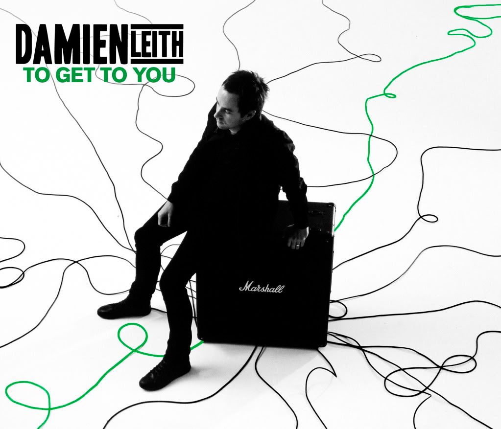
HI all!  Team Damo has been kind enough to give us the exclusive first look at the single cover to...TO GET TO YOU!!!     It looks FANTASTIC! Love it, Love it, Love it!!! OMG  Thats so HOT  |
|
|
|
Post by erinbella on Sept 4, 2009 9:35:27 GMT 10
Just popping in for another look. I love everything about it.    I better not come in here too much today or else I won't get anything done. ;D |
|
|
|
Post by Spud on Sept 4, 2009 10:41:23 GMT 10
Wow, was not expecting it to be green! But it looks cool!  Love, love, love that pic of D!  And the cables, yay!  It reminds me of one of those puzzles for kids where you have to follow tangled up strings to work out which end is joined to which ... maybe D's trying to figure out which string to follow To Get To You.  Hyp, I thought that too about the green lines.  But it makes them stand out rather than blend in, so I guess it's alright. And good point re the autograph 0z Jr, on a lot of D's other CDs, you can barely see the signature once he signs it.  Thanks Carla & Team Damo!  |
|
|
|
Post by Smiley on Sept 4, 2009 12:05:27 GMT 10
Yes, spud..I've been thinking about that...it almost has an in-transit feel..with all the leads all the places he's been or still has to go (To Get To You) and sitting on the Marshall amp almost like sitting on a suitcase....the pensive look ..it all works so well!   |
|
zeeta
Session Muso

Posts: 177
|
Post by zeeta on Sept 4, 2009 12:47:42 GMT 10
I love it, he looks stunning.
|
|
|
|
Post by hyperrune on Sept 4, 2009 12:50:01 GMT 10
Hyp, I thought that too about the green lines.  But it makes them stand out rather than blend in, so I guess it's alright. I don't mind the green lines - just like in the newsletter header, I like the red lines, it's a great concept - I just wish they were better drawn. They look a bit freehand and awkward. But that's my graphic-designer analystic side coming out. I'm criticising the execution, not the design itself - I love the design! Don't mind me, just nit-picking. There's a single black speck of dust or something near one of the cables, my fingers are itching to clone-tool over it  This is the problem when you study imagery. A bit of the magic goes  But I do love love love this cover! I love the idea, love the green colour! I wonder if they'll go with red or green for the album cover? |
|
|
|
Post by KrisLovesDamien on Sept 4, 2009 13:00:54 GMT 10
Might I also point out how much i love the angle of the shot!  Damien looks unbelievably gorgeous from that angle also!  Definitely an eye catcher on the shelves I say!  ;D  |
|
|
|
Post by Annys always here..lol on Sept 4, 2009 13:18:23 GMT 10
|
|